
Introduction
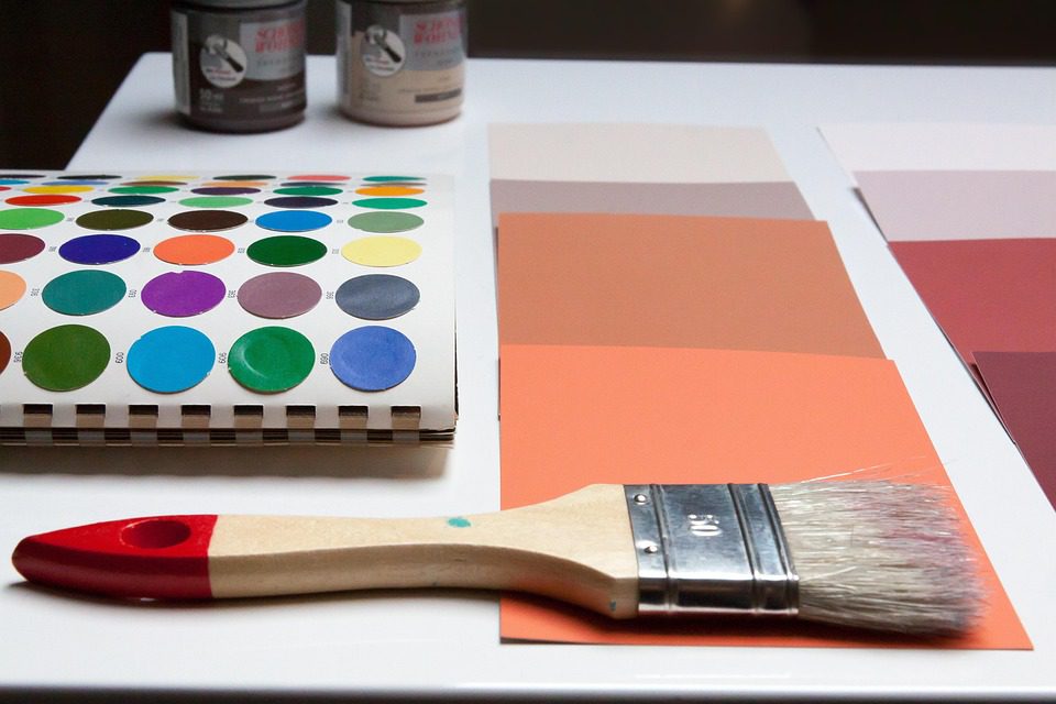
The world of color is a fascinating and complex one, where shades and hues can evoke powerful emotions, influence our moods, and even impact our behaviors. When it comes to our homes, the colors we choose can have a profound effect on our well-being and the atmosphere of each room. In this article, we’ll delve into the psychology of color, exploring the emotional impact of different colors and providing guidance on selecting a color scheme that enhances the mood and atmosphere of your space.
The Emotional Impact of Color
Colors can affect us on a deep emotional level, often unconsciously. Research has shown that colors can influence our heart rate, blood pressure, and even our appetite. For instance, the color red is known to increase heart rate and stimulate the senses, while the color blue is often associated with feelings of calmness and tranquility. Understanding the emotional impact of color is key to creating a harmonious and inviting home environment.
The Color Wheel
The color wheel is a fundamental tool for understanding color relationships and creating harmonious color schemes. The color wheel is divided into primary colors (red, yellow, and blue), secondary colors (orange, green, and violet), and tertiary colors (colors created by mixing primary and secondary colors). By understanding the color wheel, you can create color schemes that are balanced, contrasting, and visually appealing.
Primary Colors
- Red: Stimulates energy, passion, and excitement. Ideal for living rooms, dining rooms, and kitchens.
- Yellow: Evokes feelings of happiness, optimism, and warmth. Suitable for bedrooms, bathrooms, and home offices.
- Blue: Associated with calmness, trust, and stability. Often used in bedrooms, living rooms, and outdoor spaces.
Secondary Colors
- Orange: Combines the energy of red and the warmth of yellow. Perfect for creative spaces, playrooms, and entertainment areas.
- Green: Represents growth, harmony, and balance. Ideal for bedrooms, home offices, and outdoor spaces.
- Violet: Inspires creativity, luxury, and wisdom. Often used in bedrooms, living rooms, and home theaters.
Selecting a Color Scheme
When choosing a color scheme for your home, consider the following factors:
- Natural Light: Consider the amount of natural light each room receives and choose colors that complement or contrast with it.
- Furniture and Decor: Select colors that tie in with your existing furniture and decor, or use them as inspiration for your color scheme.
- Personal Preferences: Choose colors that reflect your personality, lifestyle, and personal style.
- Room Purpose: Consider the purpose of each room and choose colors that enhance its function and atmosphere.
Monochromatic Color Schemes
A monochromatic color scheme uses different shades of the same color to create a cohesive and harmonious look. This scheme is ideal for:
- Creating a sense of calmness: By using different shades of blue or green, you can create a soothing atmosphere in bedrooms and living rooms.
- Adding depth and interest: Monochromatic color schemes can add depth and visual interest to rooms with minimal furniture and decor.
Complementary Color Schemes
A complementary color scheme uses colors that are opposite each other on the color wheel to create a bold and contrasting look. This scheme is perfect for:
- Creating a statement: Complementary color schemes can add a pop of color and create a statement in rooms with neutral walls.
- Enhancing energy: By pairing colors like red and green or blue and orange, you can create a energetic and lively atmosphere in playrooms and entertainment areas.
Geo-Specific Color Trends
When it comes to color trends, different regions and cultures have their unique preferences. For instance:
- In the United States, bold and bright colors are popular in coastal regions, while more muted and earthy tones are favored in the Midwest.
- In Europe, pastel colors are often used in Scandinavian countries, while richer and more vibrant colors are popular in Mediterranean regions.
- In Australia, coastal-inspired colors like blue and green are favored, while earthy tones like brown and beige are popular in rural areas.
Frequently Asked Questions
- Q: What is the 60-30-10 rule in color design?
A: The 60-30-10 rule suggests that 60% of the room should be a dominant color, 30% a secondary color, and 10% an accent color.
- Q: What is the 60-30-10 rule in color design?
- Q: How do I choose a color scheme that complements my furniture and decor?
A: Start by identifying the dominant colors in your furniture and decor, and then choose colors that tie in with or contrast with them.
- Q: How do I choose a color scheme that complements my furniture and decor?
- Q: What are the best colors for a bedroom?
A: Calming colors like blue, green, and neutral tones like beige and gray are often recommended for bedrooms, as they promote relaxation and sleep.
- Q: What are the best colors for a bedroom?
Pro Tips and Mistakes to Avoid
- Don’t be afraid to experiment: Try out different color schemes and see what works best for your space and personality.
- Consider the color of your floors and ceilings: These can greatly impact the overall color scheme of your room.
- Don’t overlook the power of neutrals: Neutral colors like white, gray, and beige can provide a clean backdrop for bold and vibrant colors.
- Avoid overusing bold colors: While bold colors can add energy and interest, overusing them can create a overwhelming and chaotic atmosphere.
Conclusion
Choosing the perfect color palette for your home can be a daunting task, but by understanding the psychology of color and considering factors like natural light, furniture, and personal preferences, you can create a harmonious and inviting space that reflects your personality and style. Remember to experiment, consider geo-specific color trends, and don’t be afraid to seek inspiration from nature, art, and design. With these tips and guidelines, you’ll be well on your way to creating a beautiful and functional home that you’ll love spending time in.
